Client
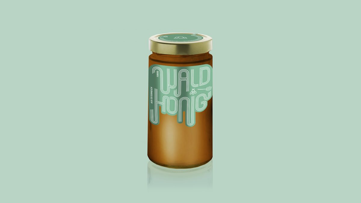
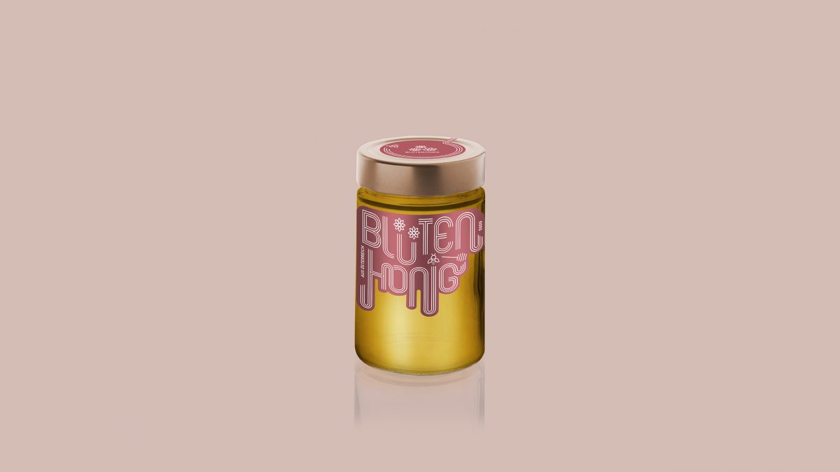
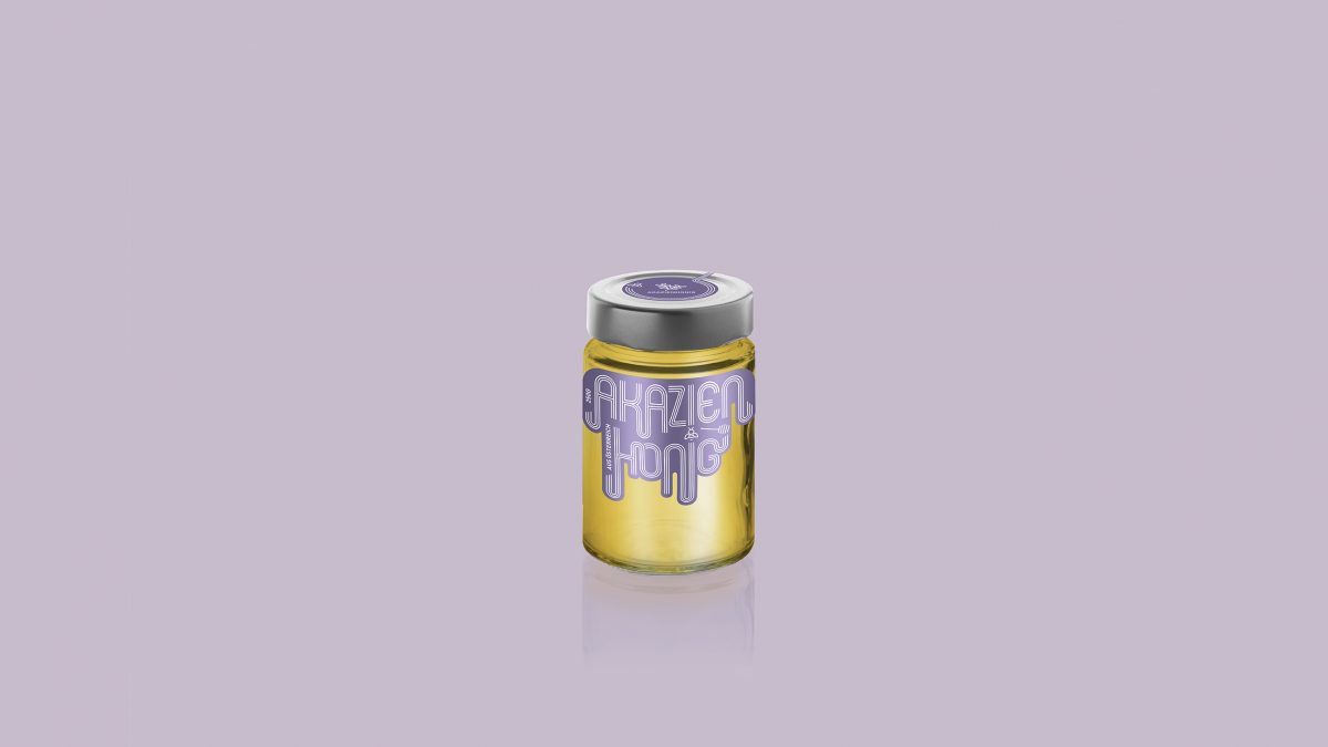
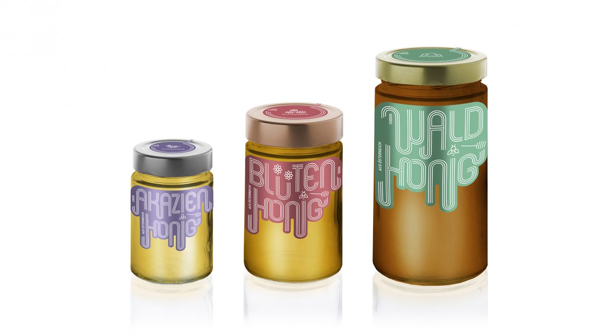
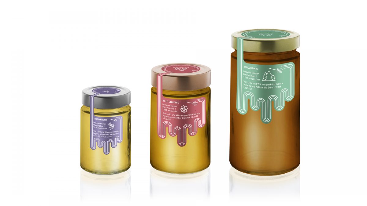
EtiveraContribution to honey packaging competition by Etivera. Created during the masterclass of die Graphische.
The typography seen on the label is running down the jar like honey.
At the same time it is created by three stripes that refer to the bee stripes or the fins of a honey spoon.

